Home
About Me

AI Support Agent
The problem was that due to layoffs in our phone support department, it became difficult for Full Sail students, instructors, and administrators had no fast way to get answers about university resources, programs, and policies outside of calling or emailing support directly.
Background
My Role
UX Designer
Organization
Full Sail University
Team
Melissa Charles
Gustavo Hernando
Scope
Conversation flow, consent design, error/empty states, feedback loop, escalation design
Tools
Figma, Figma Variables/Auto Layout, Claude (for rapid prototyping and copy exploration)
Overview
At Full sail we suffered some major losses of employees in our support call centers, and as a result support hours have been cut and newer students and faculty are having difficulty getting the support they need in a timely manner. We needed a way for students, instructors, and administrators to get answers about university resources, programs, and policies outside of calling or emailing support directly.
Discovery
The Problem
The design problem here wasn’t as simple as "how do we make a chatbot", it was more of "how do we make an AI system reliable inside an environment where the data is sensitive and different user types have access to different types of content, and there are real, un-abstract consequences if they get stuck, especially during the enrollment process.
Approach
I mapped the assistant as a system of states, not a single chat screen — treating the failure states and edge cases with the same design rigor as the core conversation. For each state, I worked through conversation flow, copy, and layout in Figma, then used Claude to rapidly explore copy variations and mockup directions before narrowing in on final patterns with engineering.
Key Decisions
Consent gate, not a legal disclaimer
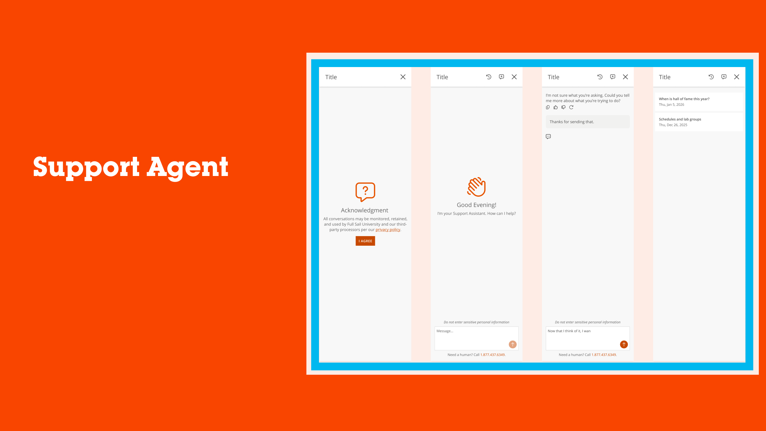
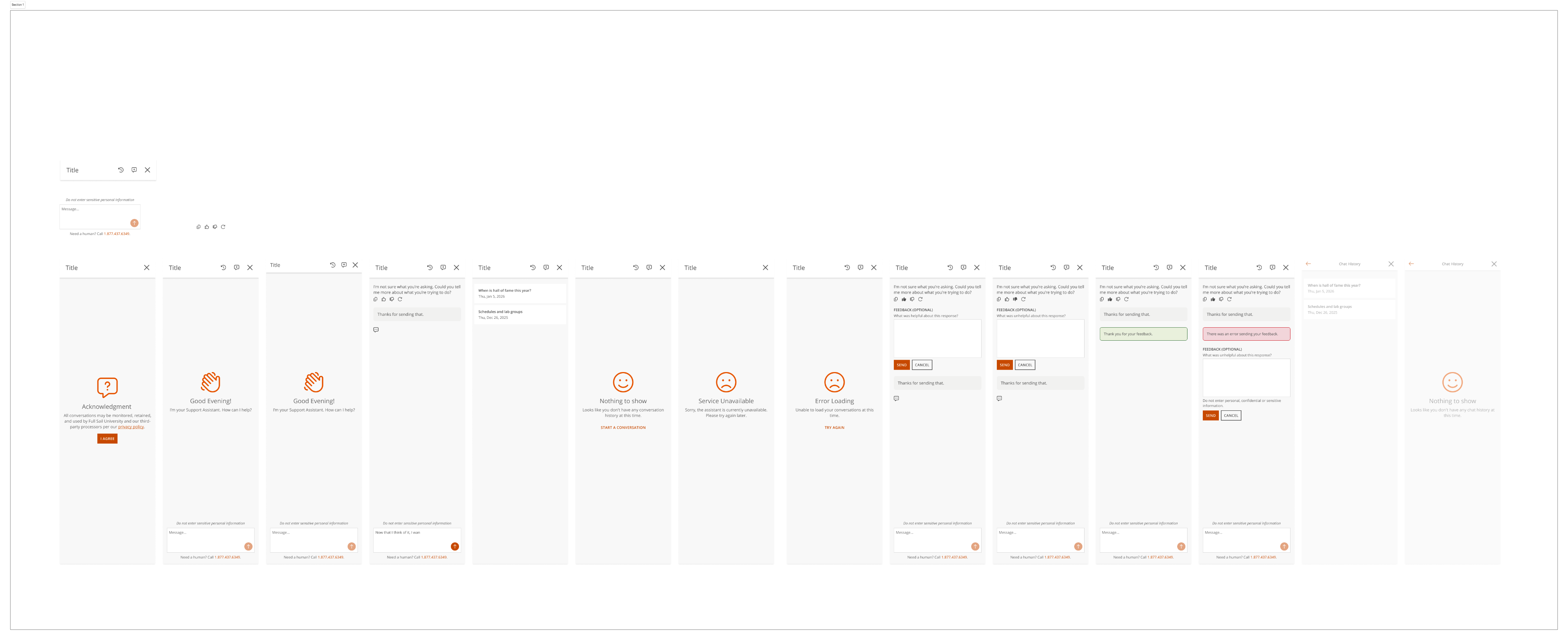
- Before any conversation starts, users see a short, plain-language acknowledgment: conversations may be monitored, retained, and used by the university and its third-party processors, with a link out to the full privacy policy. It's a single deliberate step (`I Agree`) rather than a passive cookie-banner pattern — the goal was to make the disclosure impossible to miss without making it a barrier to actually getting help.
A fallback that keeps the conversation open
- When the assistant doesn't understand a query, it says so plainly — "I'm not sure what you're asking. Could you tell me more about what you're trying to do?" — rather than guessing or looping the user through a generic menu. Every response also carries lightweight feedback controls (copy, thumbs up/down, regenerate) so a bad answer becomes a signal, not a dead end.
A feedback loop with its own failure state
- Thumbs-down responses open an optional feedback field ("What was unhelpful about this response?") rather than forcing input. I also designed for the feedback submission itself failing — including a distinct error state so a user isn't left wondering whether their input actually went through, alongside the standard confirmation ("Thanks for sending that.").
Distinguishing "nothing here" from "something broke”
- I designed three visually and tonally distinct states that are easy to conflate in a lot of chat products: an **empty state** (no chat history yet, with a clear "Start a Conversation" action), a **service unavailable** state (the assistant itself is down, framed as temporary), and an **error loading** state (a specific request failed, with a "Try Again" action). Treating these as separate patterns — rather than one generic "something went wrong" screen — meant the copy and recovery action could match what actually happened, instead of leaving the user guessing.
Escalation present in every state, not just the failure states
- "Need a human? Call [number]" appears as a persistent element across every screen; onboarding, active conversation, empty state, error state, and chat history. It’s not just surfaced reactively when something fails. The principle here was that access to a real person shouldn't depend on the AI's ability to recognize it has failed.
Chat history as its own reviewable surface
- Past conversations are timestamped and browsable independently of the live chat, with the same empty-state treatment applied when no history exists yet, keeping the pattern consistent across the product rather than one-off per surface.
Chatbot Design
Testing
To assess how well the redesigned experience met user needs, I facilitated remote evaluative session with faculty power users in a live virtual setting. Each participant represented the intended audience, allowing the study to focus on collecting feedback directly from users who regularly interact with our learning management system and workflows.
Throughout the sessions, participants explored interactive design concepts while completing guided scenarios designed to simulate realistic use cases. Using a moderated discussion format, participants shared their immediate reactions, expectations, and areas of confusion as they navigated the experience. Observations and behavioral patterns were captured throughout testing, and key findings were synthesized into short video summaries and research insights that informed conversations with project stakeholders and supported future design decisions.
How are we monitoring Conversations?
To assess how well the redesigned experience met user needs, I facilitated remote evaluative session with faculty power users in a live virtual setting. Each participant represented the intended audience, allowing the study to focus on collecting feedback directly from users who regularly interact with our learning management system and workflows.
Throughout the sessions, participants explored interactive design concepts while completing guided scenarios designed to simulate realistic use cases. Using a moderated discussion format, participants shared their immediate reactions, expectations, and areas of confusion as they navigated the experience. Observations and behavioral patterns were captured throughout testing, and key findings were synthesized into short video summaries and research insights that informed conversations with project stakeholders and supported future design decisions.
Conversation Review
- Automated flags surface sensitive conversations — for example, any indicators of self-harm — so the appropriate team can follow uppromptly.
Moderation Alerts
- Automated flags surface sensitive conversations — for example, any indicators of self-harm — so the appropriate team can follow uppromptly.
Response Feedback
- Automated flags surface sensitive conversations — for example, any indicators of self-harm — so the appropriate team can follow uppromptly.
AI-Powered Analysis
- Automated flags surface sensitive conversations — for example, any indicators of self-harm — so the appropriate team can follow uppromptly.
- Automated flags surface sensitive conversations — for example, any indicators of self-harm — so the appropriate team can follow up promptly.
- Automated flags surface sensitive conversations — for example, any indicators of self-harm — so the appropriate team can follow up promptly.
AI Support Agent
The problem was that due to layoffs in our phone support department, it became difficult for Full Sail students, instructors, and administrators had no fast way to get answers about university resources, programs, and policies outside of calling or emailing support directly.
Background
My Role
UX Designer
Organization
Full Sail University
Team
Melissa Charles
Gustavo Hernando
Scope
Conversation flow, consent design, error/empty states, feedback loop, escalation design
Tools
Figma, Figma Variables/Auto Layout, Claude (for rapid prototyping and copy exploration)
Overview
At Full sail we suffered some major losses of employees in our support call centers, and as a result support hours have been cut and newer students and faculty are having difficulty getting the support they need in a timely manner. We needed a way for students, instructors, and administrators to get answers about university resources, programs, and policies outside of calling or emailing support directly.
Discovery
The Problem
The design problem here wasn’t as simple as "how do we make a chatbot", it was more of "how do we make an AI system reliable inside an environment where the data is sensitive and different user types have access to different types of content, and there are real, un-abstract consequences if they get stuck, especially during the enrollment process.
Approach
I mapped the assistant as a system of states, not a single chat screen — treating the failure states and edge cases with the same design rigor as the core conversation. For each state, I worked through conversation flow, copy, and layout in Figma, then used Claude to rapidly explore copy variations and mockup directions before narrowing in on final patterns with engineering.
Key Decisions
Consent gate, not a legal disclaimer
- Before any conversation starts, users see a short, plain-language acknowledgment: conversations may be monitored, retained, and used by the university and its third-party processors, with a link out to the full privacy policy. It's a single deliberate step (`I Agree`) rather than a passive cookie-banner pattern — the goal was to make the disclosure impossible to miss without making it a barrier to actually getting help.
A fallback that keeps the conversation open
- When the assistant doesn't understand a query, it says so plainly — "I'm not sure what you're asking. Could you tell me more about what you're trying to do?" — rather than guessing or looping the user through a generic menu. Every response also carries lightweight feedback controls (copy, thumbs up/down, regenerate) so a bad answer becomes a signal, not a dead end.
A feedback loop with its own failure state
- Thumbs-down responses open an optional feedback field ("What was unhelpful about this response?") rather than forcing input. I also designed for the feedback submission itself failing — including a distinct error state so a user isn't left wondering whether their input actually went through, alongside the standard confirmation ("Thanks for sending that.").
Distinguishing "nothing here" from "something broke”
- I designed three visually and tonally distinct states that are easy to conflate in a lot of chat products: an **empty state** (no chat history yet, with a clear "Start a Conversation" action), a **service unavailable** state (the assistant itself is down, framed as temporary), and an **error loading** state (a specific request failed, with a "Try Again" action). Treating these as separate patterns — rather than one generic "something went wrong" screen — meant the copy and recovery action could match what actually happened, instead of leaving the user guessing.
Escalation present in every state, not just the failure states
- "Need a human? Call [number]" appears as a persistent element across every screen; onboarding, active conversation, empty state, error state, and chat history. It’s not just surfaced reactively when something fails. The principle here was that access to a real person shouldn't depend on the AI's ability to recognize it has failed.
Chat history as its own reviewable surface
- Past conversations are timestamped and browsable independently of the live chat, with the same empty-state treatment applied when no history exists yet, keeping the pattern consistent across the product rather than one-off per surface.
Chatbot Design
Testing
To assess how well the redesigned experience met user needs, I facilitated remote evaluative session with faculty power users in a live virtual setting. Each participant represented the intended audience, allowing the study to focus on collecting feedback directly from users who regularly interact with our learning management system and workflows.
Throughout the sessions, participants explored interactive design concepts while completing guided scenarios designed to simulate realistic use cases. Using a moderated discussion format, participants shared their immediate reactions, expectations, and areas of confusion as they navigated the experience. Observations and behavioral patterns were captured throughout testing, and key findings were synthesized into short video summaries and research insights that informed conversations with project stakeholders and supported future design decisions.
How are we monitoring Conversations?
Conversation Review
- Automated flags surface sensitive conversations — for example, any indicators of self-harm — so the appropriate team can follow uppromptly.
Moderation Alerts
- Automated flags surface sensitive conversations — for example, any indicators of self-harm — so the appropriate team can follow uppromptly.
Response Feedback
- Automated flags surface sensitive conversations — for example, any indicators of self-harm — so the appropriate team can follow uppromptly.
AI-Powered Analysis
- Automated flags surface sensitive conversations — for example, any indicators of self-harm — so the appropriate team can follow uppromptly.
To assess how well the redesigned experience met user needs, I facilitated remote evaluative session with faculty power users in a live virtual setting. Each participant represented the intended audience, allowing the study to focus on collecting feedback directly from users who regularly interact with our learning management system and workflows.
Throughout the sessions, participants explored interactive design concepts while completing guided scenarios designed to simulate realistic use cases. Using a moderated discussion format, participants shared their immediate reactions, expectations, and areas of confusion as they navigated the experience. Observations and behavioral patterns were captured throughout testing, and key findings were synthesized into short video summaries and research insights that informed conversations with project stakeholders and supported future design decisions.
AI Support Agent
Due to reduced support capacity in our phone support department, it became difficult for students, instructors, and administrators to find information, and get answers to their questions about university resources, programs, and policies outside of calling or emailing support directly.
Background
My Role
UX Designer
Organization
Full Sail University
Team
Melissa Charles
Gustavo Hernando
Scope
Conversation flow, consent design, error/empty states, feedback loop, escalation design
Tools
Figma, Figma Variables/Auto Layout, Claude (for rapid prototyping and copy exploration)
Overview
At Full sail we suffered some major losses of employees in our support call centers, and as a result support hours have been cut and newer students and faculty are having difficulty getting the support they need in a timely manner. We needed a way for students, instructors, and administrators to get answers about university resources, programs, and policies outside of calling or emailing support directly.
Chatbot Design
Testing
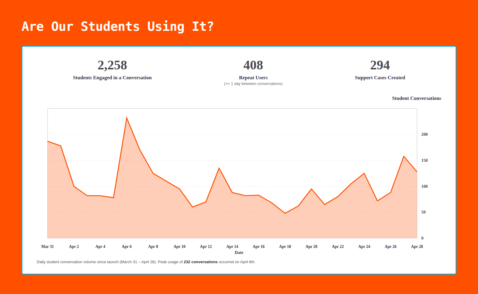
Our Support agent was launched on March 31st, and as of April 29th we saw 2,258 student conversations, saving our phone agents 2,258 phone calls. We also saw 294 support cases being created
How are we monitoring Conversations?
Ensuring the assistant delivers accurate and appropriate responses is an ongoing process. We use a layered monitoring approach to identify gaps, measure quality, and protect student wellbeing.
Conversation Review
- Automated flags surface sensitive conversations — for example, any indicators of self-harm — so the appropriate team can follow up promptly.
Moderation Alerts
- Manual review of conversations to identify content gaps, inaccurate responses, or unexpected assistant behavior that needs correction.
Response Feedback
- Students can rate each response with a thumbs up or down, giving us direct signal on what's working and what isn't.
AI-Powered Analysis
- Every conversation is analyzed for sentiment, summary, and category — providing scalable insight and helping identify potential escalation points across thousands of interactions.
Key Decisions
Consent gate, not a legal disclaimer
- Before any conversation starts, users see a short, plain-language acknowledgment: conversations may be monitored, retained, and used by the university and its third-party processors, with a link out to the full privacy policy. It's a single deliberate step (`I Agree`) rather than a passive cookie-banner pattern — the goal was to make the disclosure impossible to miss without making it a barrier to actually getting help.
A fallback that keeps the conversation open
- When the assistant doesn't understand a query, it says so plainly — "I'm not sure what you're asking. Could you tell me more about what you're trying to do?" — rather than guessing or looping the user through a generic menu. Every response also carries lightweight feedback controls (copy, thumbs up/down, regenerate) so a bad answer becomes a signal, not a dead end.
A feedback loop with its own failure state
- Thumbs-down responses open an optional feedback field ("What was unhelpful about this response?") rather than forcing input. I also designed for the feedback submission itself failing — including a distinct error state so a user isn't left wondering whether their input actually went through, alongside the standard confirmation ("Thanks for sending that.").
Distinguishing "nothing here" from "something broke”
- I designed three visually and tonally distinct states that are easy to conflate in a lot of chat products: an **empty state** (no chat history yet, with a clear "Start a Conversation" action), a **service unavailable** state (the assistant itself is down, framed as temporary), and an **error loading** state (a specific request failed, with a "Try Again" action). Treating these as separate patterns — rather than one generic "something went wrong" screen — meant the copy and recovery action could match what actually happened, instead of leaving the user guessing.
Escalation present in every state, not just the failure states
- "Need a human? Call [number]" appears as a persistent element across every screen; onboarding, active conversation, empty state, error state, and chat history. It’s not just surfaced reactively when something fails. The principle here was that access to a real person shouldn't depend on the AI's ability to recognize it has failed.
Chat history as its own reviewable surface
- Past conversations are timestamped and browsable independently of the live chat, with the same empty-state treatment applied when no history exists yet, keeping the pattern consistent across the product rather than one-off per surface.
Discovery
The Problem
The design problem here wasn’t as simple as "how do we make a chatbot", it was more of "how do we make an AI system reliable inside an environment where the data is sensitive and different user types have access to different types of content, and there are real, un-abstract consequences if they get stuck, especially during the enrollment process.
Approach
I mapped the assistant as a system of states, not a single chat screen — treating the failure states and edge cases with the same design rigor as the core conversation. For each state, I worked through conversation flow, copy, and layout in Figma, then used Claude to rapidly explore copy variations and mockup directions before narrowing in on final patterns with engineering.