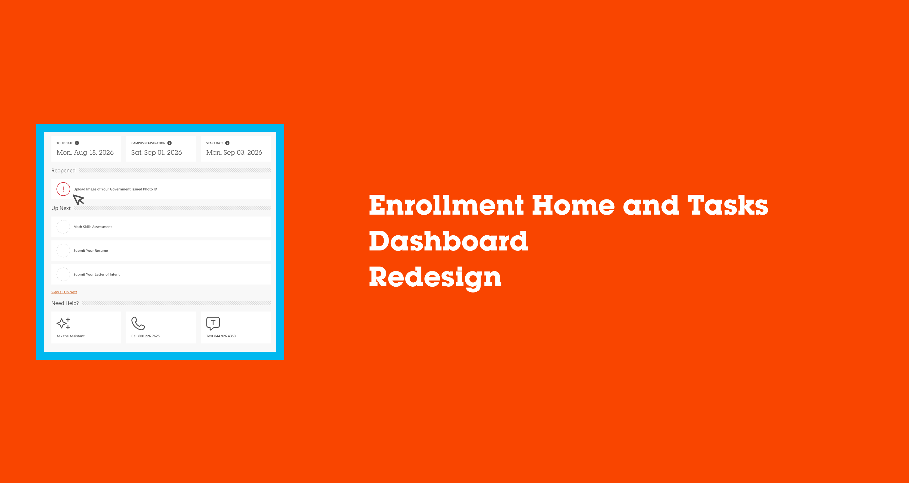

Enrollment Home and Tasks Dashboard Redesign
This case study will cover the process we took to refocus the website to streamline the enrollment experience for students.
Background
My Role
UX Designer
Organization
Full Sail University
Team
Melissa Charles
Gustavo Hernando
Discovery
Research
Research indicated that the FlightPath student onboarding experience was not serving incoming students successfully. Findings provided from a variety of sources spoke of students feeling lost in their own onboarding process, unsure of what stage they were in or what truly needed their attention next. Sources included:
- Admissions & Enrollment — student onboarding satisfaction survey
- Call Center & Support — analysis of repeat inquiries during onboarding (FAFSA, transfer credit, account setup)
- Financial Aid — focus group on document resubmission friction
- New student cohort — usability testing on the existing Tasks dashboard
Recommendations
Armed with an idea of problems to solve, we set out to explore and test options that improve the FlightPath onboarding experience to better serve incoming students.
- Identify key areas to influence and change, particularly journey context and task urgency
- Leadership alignment and technology feasibility across Admissions, Financial Aid, and Enrollment systems
- Prototype and test changes to progress visualization and task prioritization
- Review and analyze student behaviors throughout the onboarding funnel
Solutions
Key areas of the current FlightPath onboarding experience were identified for improvement with journey context, task prioritization, and information hierarchy.
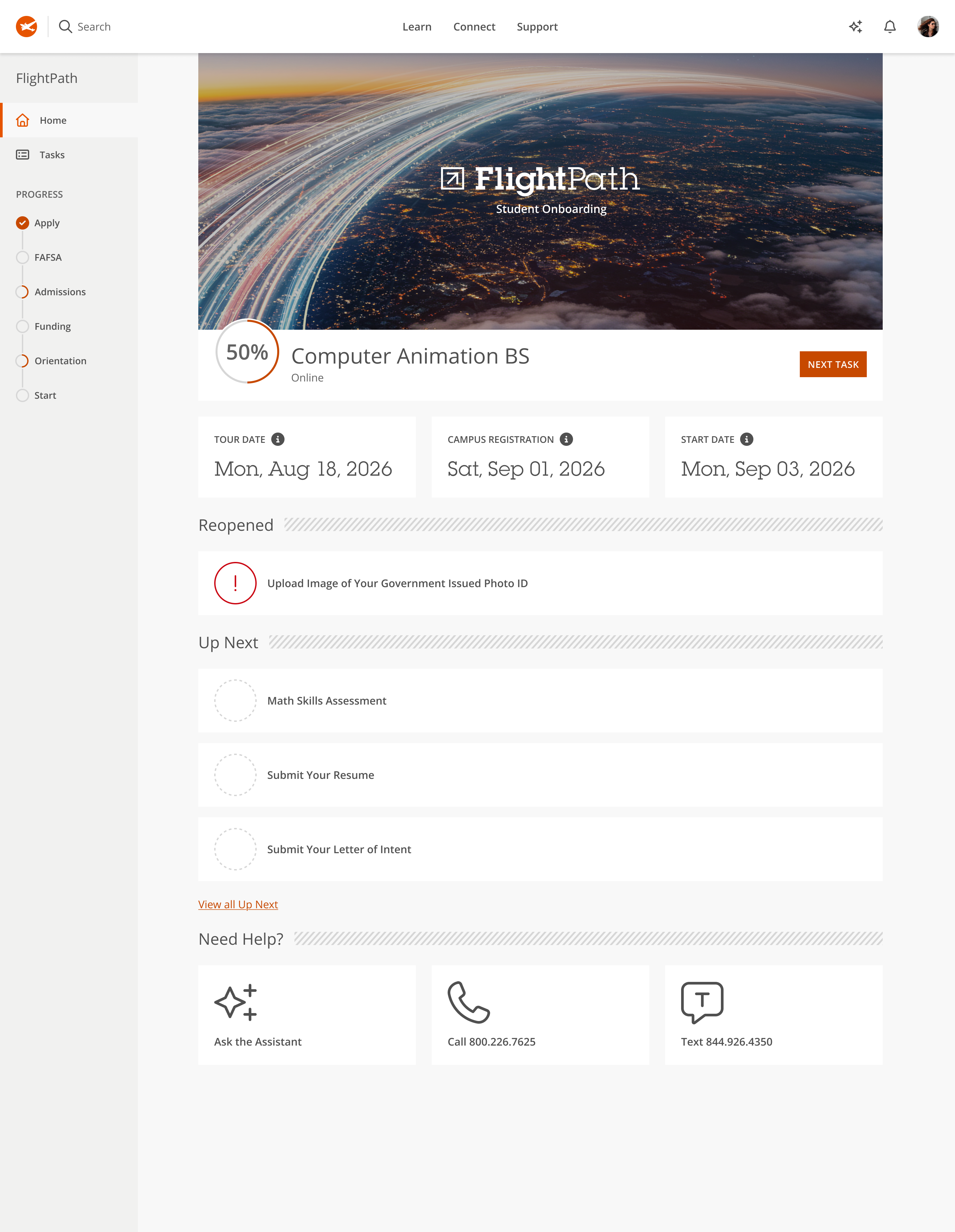
- Introduce a persistent left-rail progress tracker showing the student's current stage (Apply, FAFSA, Admissions, Funding, Orientation, Start) so students always know where they stand in the broader onboarding journey, not just within a single task list
- Replace the generic "Progress" percentage card with a program-specific progress ring tied directly to the student's declared major, reinforcing that onboarding is personalized rather than one-size-fits-all
- Surface key dates (tour date, campus registration, start date) prominently near the top, ahead of the task list, so time-sensitive milestones aren't buried
- Restructure the task list from a flat, status-labeled list into urgency-based groupings (Reopened, Up Next), prioritizing what students need to act on now over a chronological or alphabetical order
- Add a persistent "Next Task" call-to-action to reduce decision fatigue and guide students toward their single next best action
- Introduce "Ask the Assistant" as a new support entry point alongside existing call and text options, anticipating a shift toward self-service support
- Simplify the "Need Help?" section visually while keeping all existing contact channels intact, so support remained easy to find without competing with the new task prioritization
The design team and I then decided to focus our initial solution on restructuring the top of the page, the progress indicators and key dates, before tackling the full task list reorganization. We hypothesized that giving students clearer journey context first would make the subsequent shift to urgency-based task grouping feel like a natural extension rather than an entirely new system to learn.
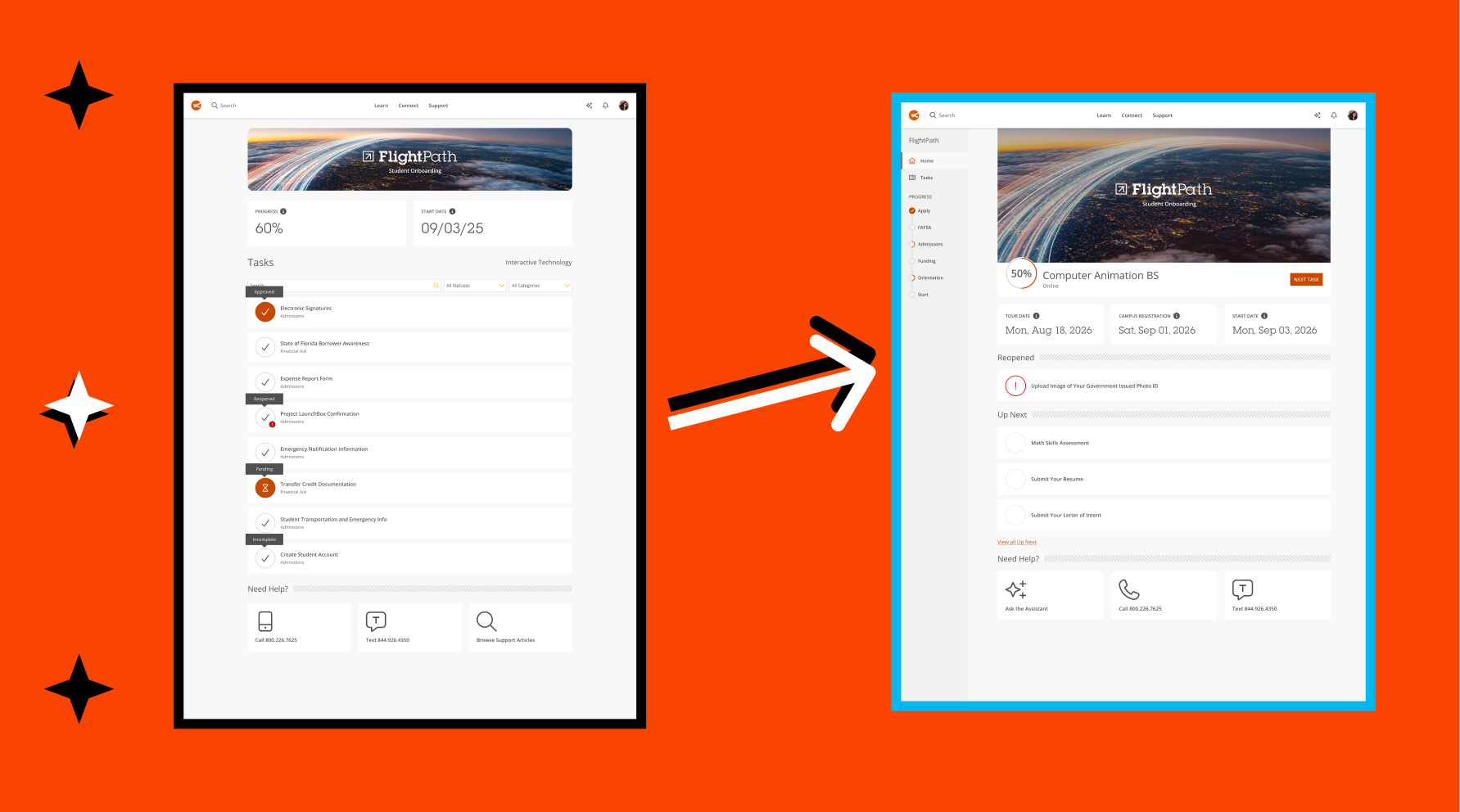
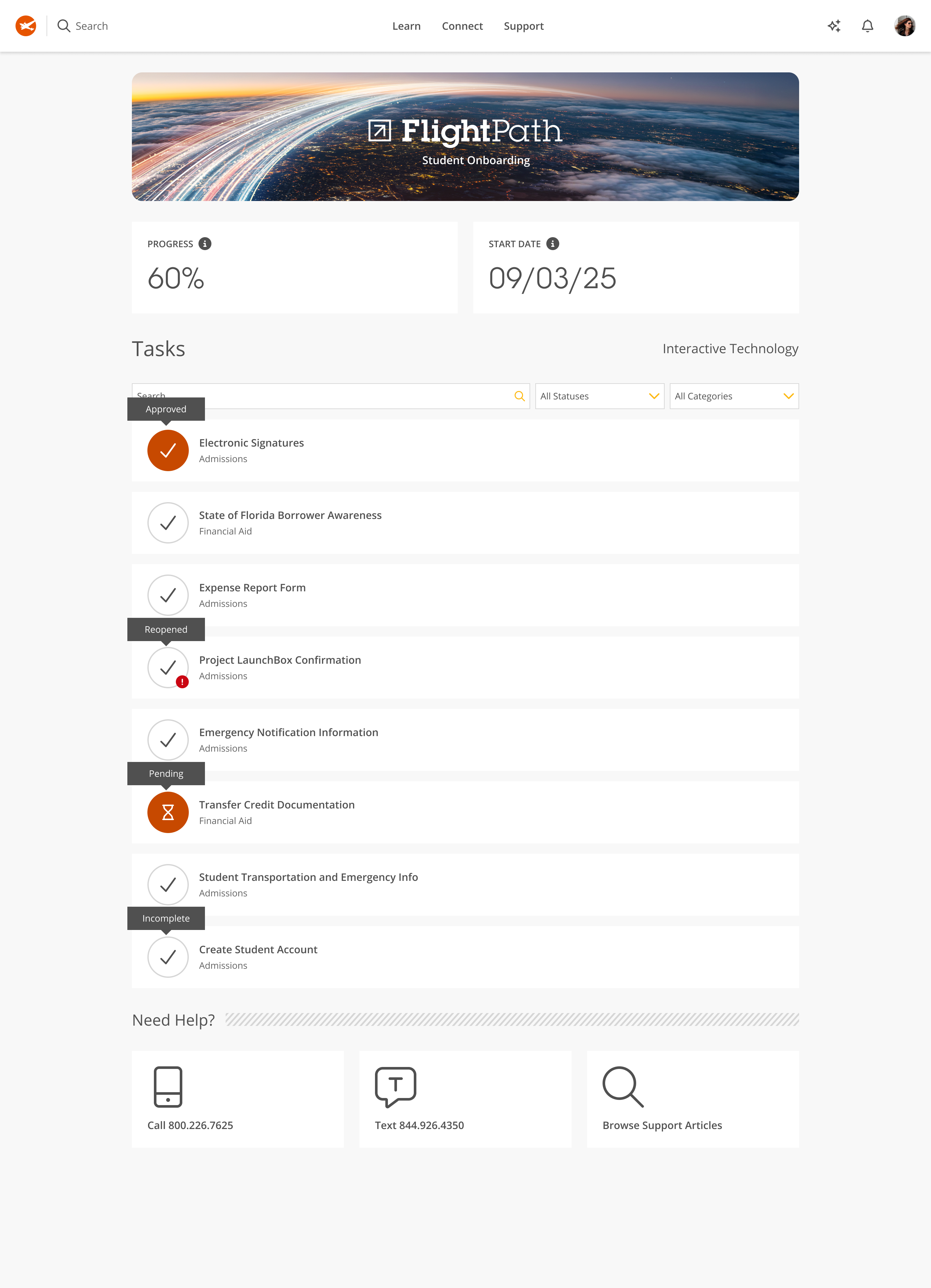
Old homepage design
Mockups
- Replaced the flat "Progress: 60%" stat card with a circular progress ring (50%) paired directly with the student's program name ("Computer Animation BS") and delivery mode ("Online"). Progress is now tied to a specific program rather than shown as an abstract, unlabeled percentage.
- Replaced that flat list with two clearly titled sections, "Reopened" and "Up Next", using diagonal-line section dividers to visually separate categories of urgency.
- Added"Next Task" button next to the progress ring, giving students a direct, single call-to-action instead of requiring them to scan the list to figure out what to do next.
- Added a new "Ask the Assistant" option (sparkle/plus icon) as the first item under "Need Help?," appearing before the existing "Call" and "Text" options.
- Removed "Browse Support Articles" as a help option, narrowing the support choices from three to three but swapping search-based self-service for AI-assisted self-service.
- Introduced a new dashed, hollow circle icon for not-yet-started tasks in "Up Next," replacing solid checkmarks or hourglasses with an empty placeholder state.
Testing
To measure the success of the redesigned FlightPath experience, I conducted remote usability testing with active students during the summer onboarding cycle, recruiting participants who were had already actively gone through the admissions, financial aid, and orientation tasks. Participants were briefly qualified prior to testing. The students were asked qualitative questions about the mockups and given tasks to perform while verbally thinking aloud throughout the process. Sessions were recorded, and clips for each task were compiled to share later with stakeholders across Admissions, Financial Aid, and Enrollment.Following the task-based sessions, I ran a quick sentiment poll with participants, asking directly whether the redesigned layout, particularly the progress tracker and urgency-based task grouping, made it easier to know what to do next. The response leaned strongly positive, with most participants landing on "agree" or "strongly agree," reinforcing that the structural changes were solving the orientation problem we'd set out to address, not just making the page look different.
Outcome
Once we had the findings, I reported to the team during a meeting with the my larger product team oI cared a lot about walking people through the why, not just showing off the new screens, because I wanted the progress tracker and task prioritization to feel like the natural result of what we'd learned, not just a fresh coat of paint.
After launching oifficially , I stayed on with the development team, refining task logic and putting together guidelines for how status states and urgency groupings should show up elsewhere in the onboarding flow, right up until my time on the project came to a close. Parts of FlightPath have since launched, and I still see refinements rolling out. Honestly, that's one of the things I'm most proud of. It tells me the collaborative habit we built into the process stuck around even after I wasn't in the room anymore.
Enrollment Home and Tasks Dashboard Redesign
This case study will cover the process we took to refocus the website to streamline the enrollment experience for students.
Background
My Role
UX Designer
Organization
Full Sail University
Team
Melissa Charles
Gustavo Hernando
Discovery
Research
Research indicated that the FlightPath student onboarding experience was not serving incoming students successfully. Findings provided from a variety of sources spoke of students feeling lost in their own onboarding process, unsure of what stage they were in or what truly needed their attention next. Sources included:
- Admissions & Enrollment — student onboarding satisfaction survey
- Call Center & Support — analysis of repeat inquiries during onboarding (FAFSA, transfer credit, account setup)
- Financial Aid — focus group on document resubmission friction
- New student cohort — usability testing on the existing Tasks dashboard
Recommendations
Armed with an idea of problems to solve, we set out to explore and test options that improve the FlightPath onboarding experience to better serve incoming students.
- Identify key areas to influence and change, particularly journey context and task urgency
- Leadership alignment and technology feasibility across Admissions, Financial Aid, and Enrollment systems
- Prototype and test changes to progress visualization and task prioritization
- Review and analyze student behaviors throughout the onboarding funnel
Solutions
Key areas of the current FlightPath onboarding experience were identified for improvement with journey context, task prioritization, and information hierarchy.
- Introduce a persistent left-rail progress tracker showing the student's current stage (Apply, FAFSA, Admissions, Funding, Orientation, Start) so students always know where they stand in the broader onboarding journey, not just within a single task list
- Replace the generic "Progress" percentage card with a program-specific progress ring tied directly to the student's declared major, reinforcing that onboarding is personalized rather than one-size-fits-all
- Surface key dates (tour date, campus registration, start date) prominently near the top, ahead of the task list, so time-sensitive milestones aren't buried
- Restructure the task list from a flat, status-labeled list into urgency-based groupings (Reopened, Up Next), prioritizing what students need to act on now over a chronological or alphabetical order
- Add a persistent "Next Task" call-to-action to reduce decision fatigue and guide students toward their single next best action
- Introduce "Ask the Assistant" as a new support entry point alongside existing call and text options, anticipating a shift toward self-service support
- Simplify the "Need Help?" section visually while keeping all existing contact channels intact, so support remained easy to find without competing with the new task prioritization
The design team and I then decided to focus our initial solution on restructuring the top of the page, the progress indicators and key dates, before tackling the full task list reorganization. We hypothesized that giving students clearer journey context first would make the subsequent shift to urgency-based task grouping feel like a natural extension rather than an entirely new system to learn.
Old homepage design
Mockups
Changes to the grading dashboard included the following:
- Replaced the flat "Progress: 60%" stat card with a circular progress ring (50%) paired directly with the student's program name ("Computer Animation BS") and delivery mode ("Online"). Progress is now tied to a specific program rather than shown as an abstract, unlabeled percentage.
- Replaced that flat list with two clearly titled sections, "Reopened" and "Up Next", using diagonal-line section dividers to visually separate categories of urgency.
- Added"Next Task" button next to the progress ring, giving students a direct, single call-to-action instead of requiring them to scan the list to figure out what to do next.
- Added a new "Ask the Assistant" option (sparkle/plus icon) as the first item under "Need Help?," appearing before the existing "Call" and "Text" options.
- Removed "Browse Support Articles" as a help option, narrowing the support choices from three to three but swapping search-based self-service for AI-assisted self-service.
- Introduced a new dashed, hollow circle icon for not-yet-started tasks in "Up Next," replacing solid checkmarks or hourglasses with an empty placeholder state.
Testing
To measure the success of the redesigned FlightPath experience, I conducted remote usability testing with active students during the summer onboarding cycle, recruiting participants who were had already actively gone through the admissions, financial aid, and orientation tasks. Participants were briefly qualified prior to testing. The students were asked qualitative questions about the mockups and given tasks to perform while verbally thinking aloud throughout the process. Sessions were recorded, and clips for each task were compiled to share later with stakeholders across Admissions, Financial Aid, and Enrollment.Following the task-based sessions, I ran a quick sentiment poll with participants, asking directly whether the redesigned layout, particularly the progress tracker and urgency-based task grouping, made it easier to know what to do next. The response leaned strongly positive, with most participants landing on "agree" or "strongly agree," reinforcing that the structural changes were solving the orientation problem we'd set out to address, not just making the page look different.
Outcome
Once we had the findings, I reported to the team during a meeting with the my larger product team oI cared a lot about walking people through the why, not just showing off the new screens, because I wanted the progress tracker and task prioritization to feel like the natural result of what we'd learned, not just a fresh coat of paint.
After launching officially I still check in on feedback given from students and do a routine feature check to make sure things are still functioning as intended. Honestly, that's one of the things I'm most proud of.
Enrollment Home and Tasks Dashboard Redesign
This case study will cover the process we took to refocus the website to streamline the enrollment experience for students.
Background
My Role
UX Designer
Organization
Full Sail University
Team
Melissa Charles
Gustavo Hernando
Discovery
Research
Research indicated that the FlightPath student onboarding experience was not serving incoming students successfully. Findings provided from a variety of sources spoke of students feeling lost in their own onboarding process, unsure of what stage they were in or what truly needed their attention next. Sources included:
- Admissions & Enrollment — student onboarding satisfaction survey
- Call Center & Support — analysis of repeat inquiries during onboarding (FAFSA, transfer credit, account setup)
- Financial Aid — focus group on document resubmission friction
- New student cohort — usability testing on the existing Tasks dashboard
Recommendations
Armed with an idea of problems to solve, we set out to explore and test options that improve the FlightPath onboarding experience to better serve incoming students.
- Identify key areas to influence and change, particularly journey context and task urgency
- Leadership alignment and technology feasibility across Admissions, Financial Aid, and Enrollment systems
- Prototype and test changes to progress visualization and task prioritization
- Review and analyze student behaviors throughout the onboarding funnel
Solutions
Key areas of the current FlightPath onboarding experience were identified for improvement with journey context, task prioritization, and information hierarchy.
- Introduce a persistent left-rail progress tracker showing the student's current stage (Apply, FAFSA, Admissions, Funding, Orientation, Start) so students always know where they stand in the broader onboarding journey, not just within a single task list
- Replace the generic "Progress" percentage card with a program-specific progress ring tied directly to the student's declared major, reinforcing that onboarding is personalized rather than one-size-fits-all
- Surface key dates (tour date, campus registration, start date) prominently near the top, ahead of the task list, so time-sensitive milestones aren't buried
- Restructure the task list from a flat, status-labeled list into urgency-based groupings (Reopened, Up Next), prioritizing what students need to act on now over a chronological or alphabetical order
- Add a persistent "Next Task" call-to-action to reduce decision fatigue and guide students toward their single next best action
- Introduce "Ask the Assistant" as a new support entry point alongside existing call and text options, anticipating a shift toward self-service support
- Simplify the "Need Help?" section visually while keeping all existing contact channels intact, so support remained easy to find without competing with the new task prioritization
The design team and I then decided to focus our initial solution on restructuring the top of the page, the progress indicators and key dates, before tackling the full task list reorganization. We hypothesized that giving students clearer journey context first would make the subsequent shift to urgency-based task grouping feel like a natural extension rather than an entirely new system to learn.
Old homepage design
Mockups
- Replaced the flat "Progress: 60%" stat card with a circular progress ring (50%) paired directly with the student's program name ("Computer Animation BS") and delivery mode ("Online"). Progress is now tied to a specific program rather than shown as an abstract, unlabeled percentage.
- Replaced that flat list with two clearly titled sections, "Reopened" and "Up Next", using diagonal-line section dividers to visually separate categories of urgency.
- Added"Next Task" button next to the progress ring, giving students a direct, single call-to-action instead of requiring them to scan the list to figure out what to do next.
- Added a new "Ask the Assistant" option (sparkle/plus icon) as the first item under "Need Help?," appearing before the existing "Call" and "Text" options.
- Removed "Browse Support Articles" as a help option, narrowing the support choices from three to three but swapping search-based self-service for AI-assisted self-service.
- Introduced a new dashed, hollow circle icon for not-yet-started tasks in "Up Next," replacing solid checkmarks or hourglasses with an empty placeholder state.
Testing
To measure the success of the redesigned FlightPath experience, I conducted remote usability testing with active students during the summer onboarding cycle, recruiting participants who were had already actively gone through the admissions, financial aid, and orientation tasks. Participants were briefly qualified prior to testing. The students were asked qualitative questions about the mockups and given tasks to perform while verbally thinking aloud throughout the process. Sessions were recorded, and clips for each task were compiled to share later with stakeholders across Admissions, Financial Aid, and Enrollment.Following the task-based sessions, I ran a quick sentiment poll with participants, asking directly whether the redesigned layout, particularly the progress tracker and urgency-based task grouping, made it easier to know what to do next. The response leaned strongly positive, with most participants landing on "agree" or "strongly agree," reinforcing that the structural changes were solving the orientation problem we'd set out to address, not just making the page look different.
Outcome
Once we had the findings, I reported to the team during a meeting with the my larger product team oI cared a lot about walking people through the why, not just showing off the new screens, because I wanted the progress tracker and task prioritization to feel like the natural result of what we'd learned, not just a fresh coat of paint.
After launching oifficially , I stayed on with the development team, refining task logic and putting together guidelines for how status states and urgency groupings should show up elsewhere in the onboarding flow, right up until my time on the project came to a close. Parts of FlightPath have since launched, and I still see refinements rolling out. Honestly, that's one of the things I'm most proud of. It tells me the collaborative habit we built into the process stuck around even after I wasn't in the room anymore.
Enrollment Home and Tasks Dashboard Redesign
This case study will cover the process we took to refocus the website to streamline the enrollment experience for students.
Background
My Role
UX Designer
Organization
Full Sail University
Team
Melissa Charles
Gustavo Hernando
Discovery
Research
Research indicated that the FlightPath student onboarding experience was not serving incoming students successfully. Findings provided from a variety of sources spoke of students feeling lost in their own onboarding process, unsure of what stage they were in or what truly needed their attention next. Sources included:
- Admissions & Enrollment — student onboarding satisfaction survey
- Call Center & Support — analysis of repeat inquiries during onboarding (FAFSA, transfer credit, account setup)
- Financial Aid — focus group on document resubmission friction
- New student cohort — usability testing on the existing Tasks dashboard
Recommendations
Armed with an idea of problems to solve, we set out to explore and test options that improve the FlightPath onboarding experience to better serve incoming students.
- Identify key areas to influence and change, particularly journey context and task urgency
- Leadership alignment and technology feasibility across Admissions, Financial Aid, and Enrollment systems
- Prototype and test changes to progress visualization and task prioritization
- Review and analyze student behaviors throughout the onboarding funnel
Solutions
Key areas of the current FlightPath onboarding experience were identified for improvement with journey context, task prioritization, and information hierarchy.
- Introduce a persistent left-rail progress tracker showing the student's current stage (Apply, FAFSA, Admissions, Funding, Orientation, Start) so students always know where they stand in the broader onboarding journey, not just within a single task list
- Replace the generic "Progress" percentage card with a program-specific progress ring tied directly to the student's declared major, reinforcing that onboarding is personalized rather than one-size-fits-all
- Surface key dates (tour date, campus registration, start date) prominently near the top, ahead of the task list, so time-sensitive milestones aren't buried
- Restructure the task list from a flat, status-labeled list into urgency-based groupings (Reopened, Up Next), prioritizing what students need to act on now over a chronological or alphabetical order
- Add a persistent "Next Task" call-to-action to reduce decision fatigue and guide students toward their single next best action
- Introduce "Ask the Assistant" as a new support entry point alongside existing call and text options, anticipating a shift toward self-service support
- Simplify the "Need Help?" section visually while keeping all existing contact channels intact, so support remained easy to find without competing with the new task prioritization
The design team and I then decided to focus our initial solution on restructuring the top of the page, the progress indicators and key dates, before tackling the full task list reorganization. We hypothesized that giving students clearer journey context first would make the subsequent shift to urgency-based task grouping feel like a natural extension rather than an entirely new system to learn.
Old homepage design
Mockups
Changes to the grading dashboard included the following:
- Replaced the flat "Progress: 60%" stat card with a circular progress ring (50%) paired directly with the student's program name ("Computer Animation BS") and delivery mode ("Online"). Progress is now tied to a specific program rather than shown as an abstract, unlabeled percentage.
- Replaced that flat list with two clearly titled sections, "Reopened" and "Up Next", using diagonal-line section dividers to visually separate categories of urgency.
- Added"Next Task" button next to the progress ring, giving students a direct, single call-to-action instead of requiring them to scan the list to figure out what to do next.
- Added a new "Ask the Assistant" option (sparkle/plus icon) as the first item under "Need Help?," appearing before the existing "Call" and "Text" options.
- Removed "Browse Support Articles" as a help option, narrowing the support choices from three to three but swapping search-based self-service for AI-assisted self-service.
- Introduced a new dashed, hollow circle icon for not-yet-started tasks in "Up Next," replacing solid checkmarks or hourglasses with an empty placeholder state.
Testing
To measure the success of the redesigned FlightPath experience, I conducted remote usability testing with active students during the summer onboarding cycle, recruiting participants who were had already actively gone through the admissions, financial aid, and orientation tasks. Participants were briefly qualified prior to testing. The students were asked qualitative questions about the mockups and given tasks to perform while verbally thinking aloud throughout the process. Sessions were recorded, and clips for each task were compiled to share later with stakeholders across Admissions, Financial Aid, and Enrollment.Following the task-based sessions, I ran a quick sentiment poll with participants, asking directly whether the redesigned layout, particularly the progress tracker and urgency-based task grouping, made it easier to know what to do next. The response leaned strongly positive, with most participants landing on "agree" or "strongly agree," reinforcing that the structural changes were solving the orientation problem we'd set out to address, not just making the page look different.
Outcome
Once we had the findings, I reported to the team during a meeting with the my larger product team oI cared a lot about walking people through the why, not just showing off the new screens, because I wanted the progress tracker and task prioritization to feel like the natural result of what we'd learned, not just a fresh coat of paint.
After launching officially I still check in on feedback given from students and do a routine feature check to make sure things are still functioning as intended. Honestly, that's one of the things I'm most proud of.
Enrollment Home and Tasks Dashboard Redesign
This case study will cover the process we took to refocus the website to streamline the enrollment experience for students.
Background
My Role
UX Designer
Organization
Full Sail University
Team
Melissa Charles
Gustavo Hernando
Discovery
Research
Research indicated that the FlightPath student onboarding experience was not serving incoming students successfully. Findings provided from a variety of sources spoke of students feeling lost in their own onboarding process, unsure of what stage they were in or what truly needed their attention next. Sources included:
- Admissions & Enrollment — student onboarding satisfaction survey
- Call Center & Support — analysis of repeat inquiries during onboarding (FAFSA, transfer credit, account setup)
- Financial Aid — focus group on document resubmission friction
- New student cohort — usability testing on the existing Tasks dashboard
Recommendations
Armed with an idea of problems to solve, we set out to explore and test options that improve the FlightPath onboarding experience to better serve incoming students.
- Identify key areas to influence and change, particularly journey context and task urgency
- Leadership alignment and technology feasibility across Admissions, Financial Aid, and Enrollment systems
- Prototype and test changes to progress visualization and task prioritization
- Review and analyze student behaviors throughout the onboarding funnel
Solutions
Key areas of the current FlightPath onboarding experience were identified for improvement with journey context, task prioritization, and information hierarchy.
- Introduce a persistent left-rail progress tracker showing the student's current stage (Apply, FAFSA, Admissions, Funding, Orientation, Start) so students always know where they stand in the broader onboarding journey, not just within a single task list
- Replace the generic "Progress" percentage card with a program-specific progress ring tied directly to the student's declared major, reinforcing that onboarding is personalized rather than one-size-fits-all
- Surface key dates (tour date, campus registration, start date) prominently near the top, ahead of the task list, so time-sensitive milestones aren't buried
- Restructure the task list from a flat, status-labeled list into urgency-based groupings (Reopened, Up Next), prioritizing what students need to act on now over a chronological or alphabetical order
- Add a persistent "Next Task" call-to-action to reduce decision fatigue and guide students toward their single next best action
- Introduce "Ask the Assistant" as a new support entry point alongside existing call and text options, anticipating a shift toward self-service support
- Simplify the "Need Help?" section visually while keeping all existing contact channels intact, so support remained easy to find without competing with the new task prioritization
The design team and I then decided to focus our initial solution on restructuring the top of the page, the progress indicators and key dates, before tackling the full task list reorganization. We hypothesized that giving students clearer journey context first would make the subsequent shift to urgency-based task grouping feel like a natural extension rather than an entirely new system to learn.
Old homepage design
Mockups
Changes to the grading dashboard included the following:
- Replaced the flat "Progress: 60%" stat card with a circular progress ring (50%) paired directly with the student's program name ("Computer Animation BS") and delivery mode ("Online"). Progress is now tied to a specific program rather than shown as an abstract, unlabeled percentage.
- Replaced that flat list with two clearly titled sections, "Reopened" and "Up Next", using diagonal-line section dividers to visually separate categories of urgency.
- Added"Next Task" button next to the progress ring, giving students a direct, single call-to-action instead of requiring them to scan the list to figure out what to do next.
- Added a new "Ask the Assistant" option (sparkle/plus icon) as the first item under "Need Help?," appearing before the existing "Call" and "Text" options.
- Removed "Browse Support Articles" as a help option, narrowing the support choices from three to three but swapping search-based self-service for AI-assisted self-service.
- Introduced a new dashed, hollow circle icon for not-yet-started tasks in "Up Next," replacing solid checkmarks or hourglasses with an empty placeholder state.
Testing
To measure the success of the redesigned FlightPath experience, I conducted remote usability testing with active students during the summer onboarding cycle, recruiting participants who were had already actively gone through the admissions, financial aid, and orientation tasks. Participants were briefly qualified prior to testing. The students were asked qualitative questions about the mockups and given tasks to perform while verbally thinking aloud throughout the process. Sessions were recorded, and clips for each task were compiled to share later with stakeholders across Admissions, Financial Aid, and Enrollment.Following the task-based sessions, I ran a quick sentiment poll with participants, asking directly whether the redesigned layout, particularly the progress tracker and urgency-based task grouping, made it easier to know what to do next. The response leaned strongly positive, with most participants landing on "agree" or "strongly agree," reinforcing that the structural changes were solving the orientation problem we'd set out to address, not just making the page look different.
Outcome
Once we had the findings, I reported to the team during a meeting with the my larger product team oI cared a lot about walking people through the why, not just showing off the new screens, because I wanted the progress tracker and task prioritization to feel like the natural result of what we'd learned, not just a fresh coat of paint.
After launching officially I still check in on feedback given from students and do a routine feature check to make sure things are still functioning as intended. Honestly, that's one of the things I'm most proud of.