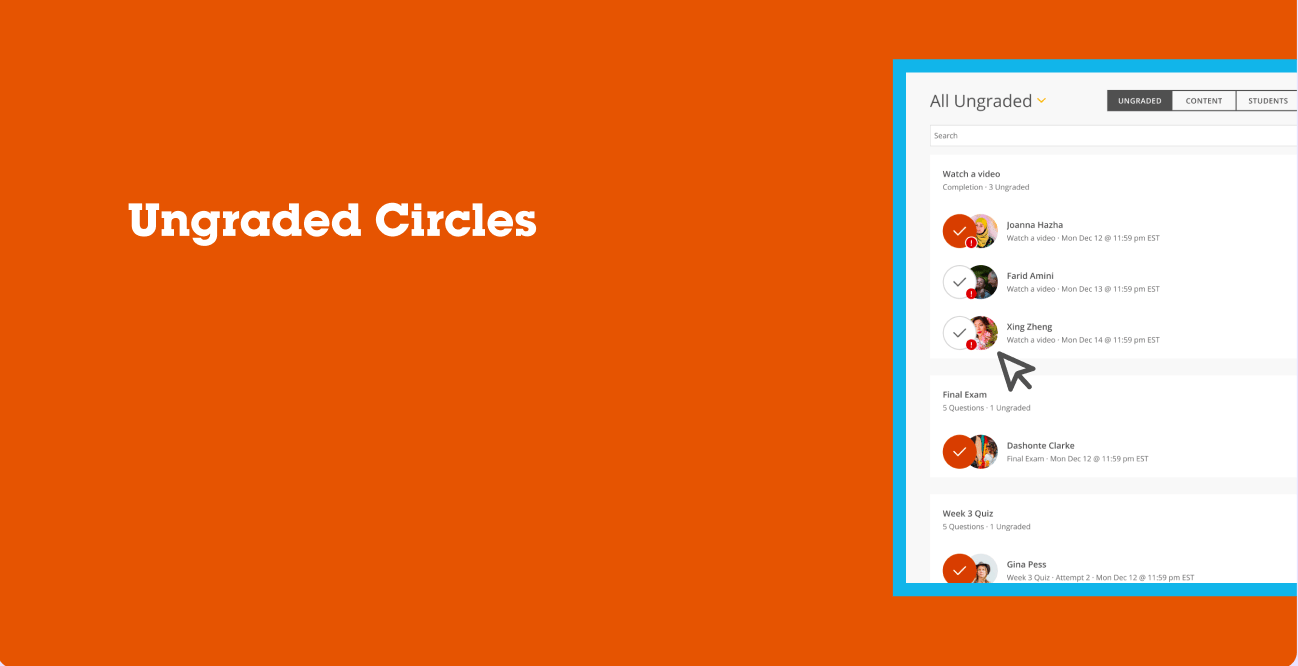

Ungraded Circles Redesign
The problem was that instructors and faculty were having a difficult time being able to identify at a glance which students had assignments that needed attention for grading or even to be able to quickly tell who completed the assignment vs who did not.
Background
My Role
UX Designer
Organization
Full Sail University
Team
Melissa Charles
Gustavo Hernando
Discovery
Research
We started by digging into why instructors were struggling with the Grading dashboard in Full Sail's LMS. The "All Ungraded" queue was technically showing everything it needed to, but instructors kept telling us they couldn't tell, at a glance, what they'd already handled versus what was still sitting in their queue. I pulled together a few different angles to get the full picture:
- hosted usability sessions with faculty to watch how they actually moved through their grading queue, not just how they said they did it
- Reviewed help desk tickets flagged by Academic Support to spot recurring pain points around grading confusion
- Ran a heuristic evaluation of the existing "All Ungraded" view to see where it broke from familiar patterns instructors expect
- Talked directly with instructors to hear what their day-to-day grading routine actually looked like
Recommendations
Once I had a clearer sense of where things were breaking down, I focused on figuring out what to change and how to get there responsibly:
- Pinned down the specific moments in the flow where instructors lost track of progress, especially around status visibility
- Looped in leadership early to make sure the direction was feasible and aligned with where the platform was headed
- Built out prototypes with clearer status indicators and tested them with real instructors
- Watched how instructors actually used the updated design before calling it done, then adjusted from there
Solutions
Key areas of the current Grading dashboard were identified for improvement with status visibility, scanability, and instructor decision-making speed.
Introduce a unified status indicator system (colored circle overlays) directly on student avatars to replace scattered, inconsistent notification badges
Differentiate "graded" vs. "ungraded" at a glance using a consistent visual language (filled orange circle with checkmark vs. outlined circle with checkmark)
Preserve the urgent-flag indicator (red badge) as a secondary layer so instructors can still spot priority submissions without losing the primary status signal
Maintain grouping by assignment type (Watch a video, Final Exam, Week 3 Quiz) so status changes don't disrupt existing mental models of how the queue is organized
Keep the toggle between Ungraded / Content / Students views intact, ensuring the new status system worked across all three contexts, not just the default queue
Apply the same status pattern consistently across list and grid view options to avoid creating two competing visual languages
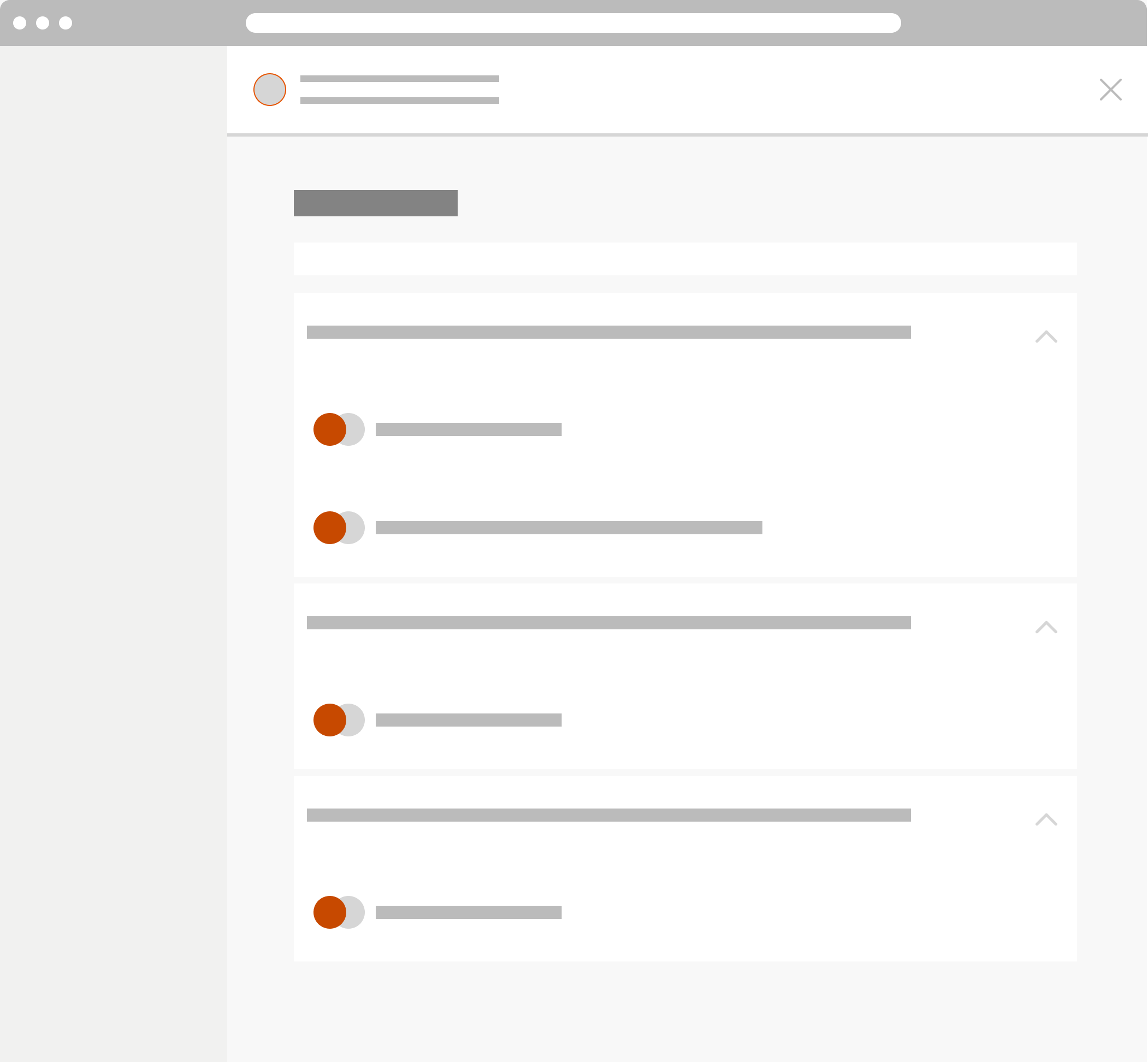
The design team and I then decided to focus our initial solution on the avatar-level status indicator specifically, rather than redesigning the entire grading queue layout. We hypothesized that a smaller, contained visual change would be faster for engineering to implement, easier for instructors to learn in a single glance, and would let us validate the core idea (does a status circle actually help prioritization?) before investing in a larger structural overhaul of the page.
Old homepage design
Mockups
Changes to the grading dashboard included the following:
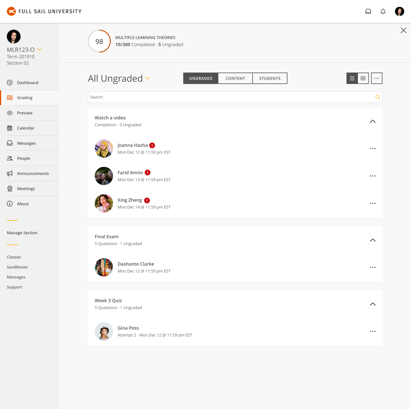
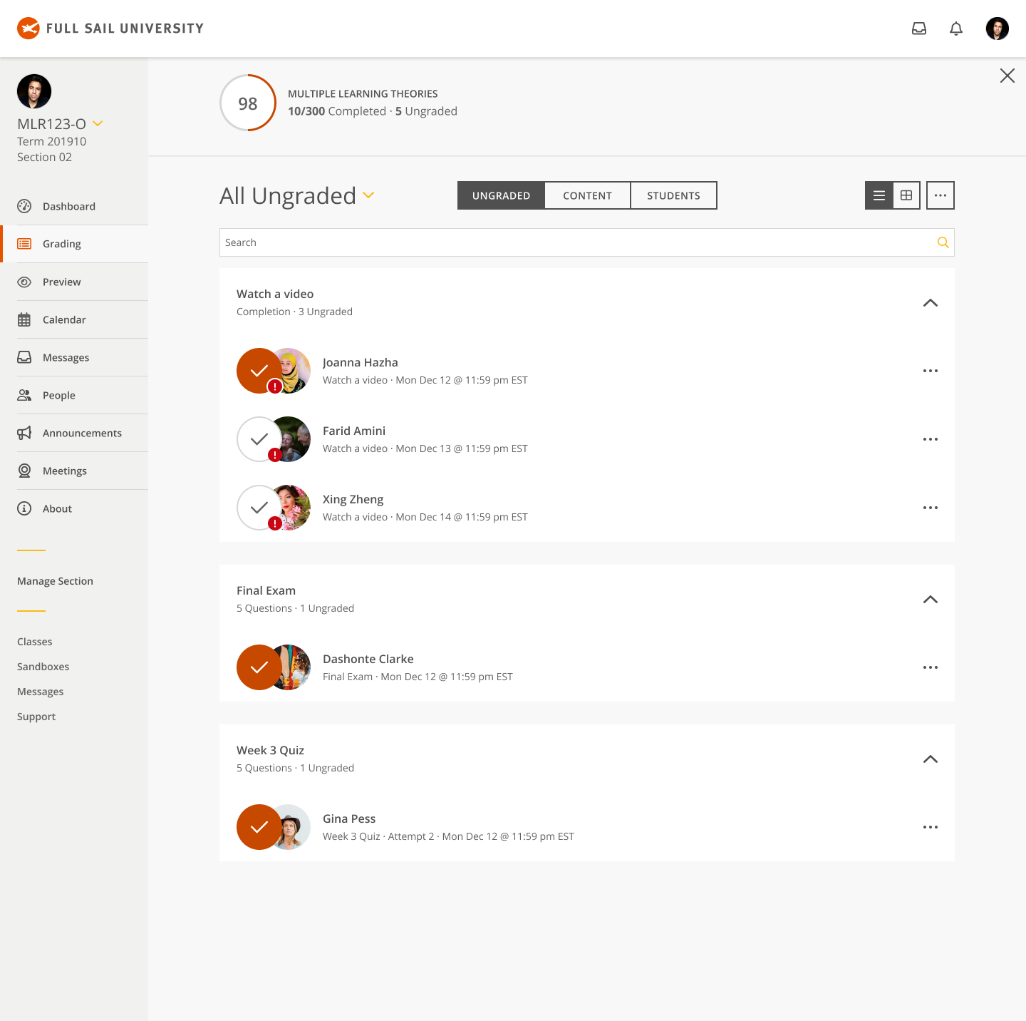
- Replaced the plain avatar-only treatment with a layered status circle overlay, giving instructors an immediate visual read on graded versus ungraded submissions without needing to scan timestamps or open each item.
- Refined the status circle styling from an early flat orange fill to a more distinct two-state system: a solid filled circle with a white checkmark for graded work, and an outlined circle with a checkmark for work still pending review, so the two states are legible even at a quick glance.
- Preserved the red urgency badge as a secondary indicator nested on the avatar, ensuring instructors could still identify flagged or time-sensitive submissions without that signal competing with the new status circle.
- Kept the underlying queue structure (assignment grouping, search, and Ungraded/Content/Students toggle) untouched, so the improvement layered cleanly onto an interaction pattern instructors already knew.
Testing
To assess how well the redesigned experience met user needs, I facilitated remote evaluative session with faculty power users in a live virtual setting. Each participant represented the intended audience, allowing the study to focus on collecting feedback directly from users who regularly interact with our learning management system and workflows.
Throughout the sessions, participants explored interactive design concepts while completing guided scenarios designed to simulate realistic use cases. Using a moderated discussion format, participants shared their immediate reactions, expectations, and areas of confusion as they navigated the experience. Observations and behavioral patterns were captured throughout testing, and key findings were synthesized into short video summaries and research insights that informed conversations with project stakeholders and supported future design decisions.
Outcome
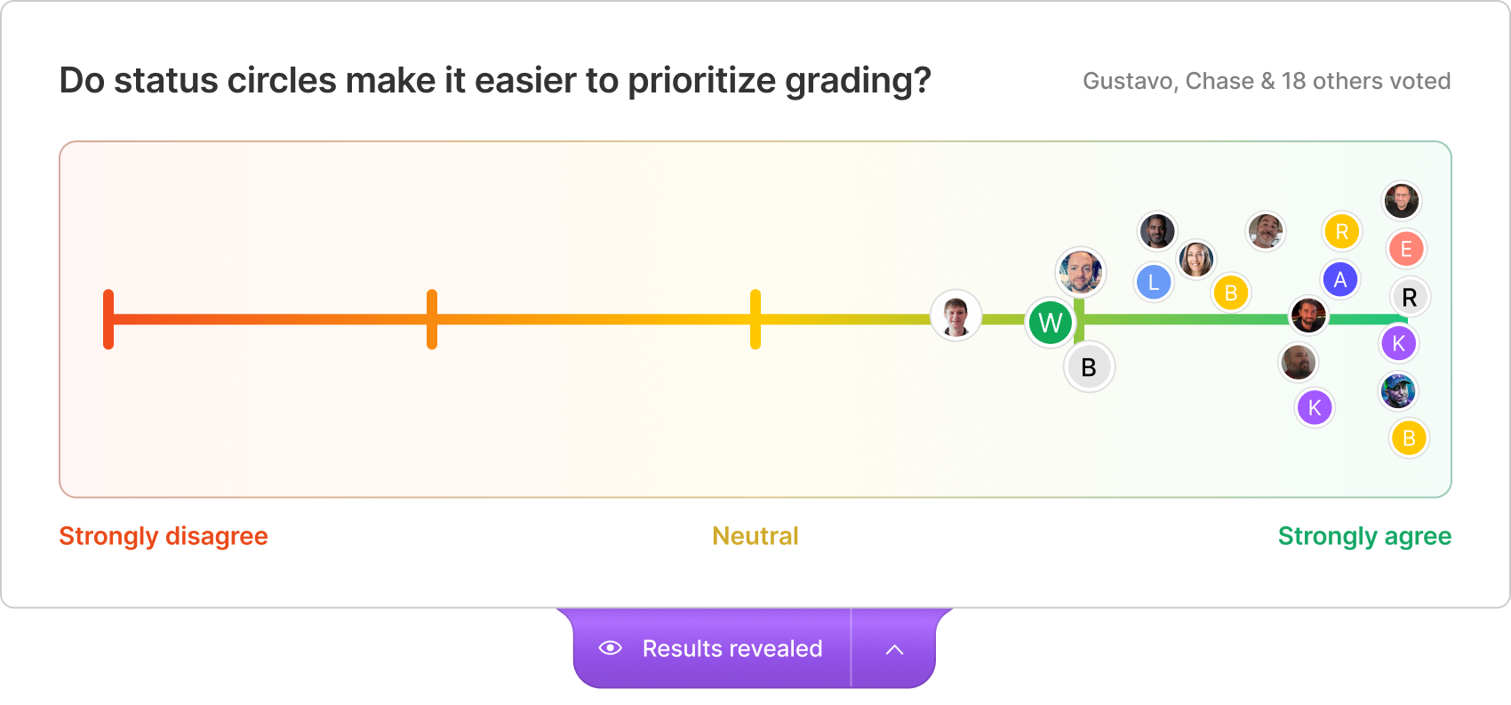
After testing with our Jedi Council Focus group the new status indicators went live, I ran a poll with the instructors who'd been using the updated grading dashboard, asking them directly: do the status circles make it easier to prioritize grading? Out of 20 respondents, the response leaned overwhelmingly positive, with the vast majority landing on "strongly agree" and only a couple sitting near neutral. Nobody disagreed.
That result mattered to me beyond just validating a UI tweak. It confirmed that the instinct we'd built the whole project around, that instructors needed a faster way to scan their queue and know what still needed their attention, was right. I shared these findings with the broader product and faculty experience teams, walking through not just the result but the research path that got us there, so the win felt earned rather than lucky.
I continued working with the development team afterward, refining edge cases in the status logic (like submissions flagged for resubmission or partial completion) and documenting clear guidelines for how status indicators should behave across other areas of the LMS, not just the grading queue. Seeing instructors respond this clearly to a small, focused change reinforced something I carry into every project since: sometimes the highest-leverage fix isn't a redesign, it's making the system finally say what it already knew.
Ungraded Circles Redesign
The problem was that instructors and faculty were having a difficult time being able to identify at a glance which students had assignments that needed attention for grading or even to be able to quickly tell who completed the assignment vs who did not.
Background
My Role
UX Designer
Organization
Full Sail University
Team
Melissa Charles
Gustavo Hernando
Discovery
Research
We started by digging into why instructors were struggling with the Grading dashboard in Full Sail's LMS. The "All Ungraded" queue was technically showing everything it needed to, but instructors kept telling us they couldn't tell, at a glance, what they'd already handled versus what was still sitting in their queue. I pulled together a few different angles to get the full picture:
- hosted usability sessions with faculty to watch how they actually moved through their grading queue, not just how they said they did it
- Reviewed help desk tickets flagged by Academic Support to spot recurring pain points around grading confusion
- Ran a heuristic evaluation of the existing "All Ungraded" view to see where it broke from familiar patterns instructors expect
- Talked directly with instructors to hear what their day-to-day grading routine actually looked like
Recommendations
Once I had a clearer sense of where things were breaking down, I focused on figuring out what to change and how to get there responsibly:
- Pinned down the specific moments in the flow where instructors lost track of progress, especially around status visibility
- Looped in leadership early to make sure the direction was feasible and aligned with where the platform was headed
- Built out prototypes with clearer status indicators and tested them with real instructors
- Watched how instructors actually used the updated design before calling it done, then adjusted from there
Solutions
Key areas of the current Grading dashboard were identified for improvement with status visibility, scan-ability, and instructor decision-making speed.
- Introduce a unified status indicator system (colored circle overlays) directly on student avatars to replace scattered, inconsistent notification badges
- Differentiate "graded" vs. "ungraded" at a glance using a consistent visual language (filled orange circle with checkmark vs. outlined circle with checkmark)
- Preserve the urgent-flag indicator (red badge) as a secondary layer so instructors can still spot priority submissions without losing the primary status signal
- Maintain grouping by assignment type (Watch a video, Final Exam, Week 3 Quiz) so status changes don't disrupt existing mental models of how the queue is organized
The design team and I then decided to focus our initial solution on the avatar-level status indicator specifically, rather than redesigning the entire grading queue layout. We hypothesized that a smaller, contained visual change would be faster for engineering to implement, easier for instructors to learn in a single glance, and would let us validate the core idea (does a status circle actually help prioritization?) before investing in a larger structural overhaul of the page.
Old homepage design
Mockups
Changes to the grading dashboard included the following:
- Replaced the plain avatar-only treatment with a layered status circle overlay, giving instructors an immediate visual read on graded versus ungraded submissions without needing to scan timestamps or open each item.
- Refined the status circle styling from an early flat orange fill to a more distinct two-state system: a solid filled circle with a white checkmark for graded work, and an outlined circle with a checkmark for work still pending review, so the two states are legible even at a quick glance.
- Preserved the red urgency badge as a secondary indicator nested on the avatar, ensuring instructors could still identify flagged or time-sensitive submissions without that signal competing with the new status circle.
- Kept the underlying queue structure (assignment grouping, search, and Ungraded/Content/Students toggle) untouched, so the improvement layered cleanly onto an interaction pattern instructors already knew.
Testing
To assess how well the redesigned experience met user needs, I facilitated remote evaluative session with faculty power users in a live virtual setting. Each participant represented the intended audience, allowing the study to focus on collecting feedback directly from users who regularly interact with our learning management system and workflows.
Throughout the sessions, participants explored interactive design concepts while completing guided scenarios designed to simulate realistic use cases. Using a moderated discussion format, participants shared their immediate reactions, expectations, and areas of confusion as they navigated the experience. Observations and behavioral patterns were captured throughout testing.
Outcome
After testing with our Jedi Council Focus group the new status indicators went live, I ran a poll with the instructors who'd been using the updated grading dashboard, asking them directly: do the status circles make it easier to prioritize grading? Out of 20 respondents, the response leaned overwhelmingly positive, with the vast majority landing on "strongly agree" and only a couple sitting near neutral. Nobody disagreed.
That result mattered to me beyond just validating a UI tweak. It confirmed that the instinct we'd built the whole project around, that instructors needed a faster way to scan their queue and know what still needed their attention, was right. I shared these findings with the broader product and faculty experience teams, walking through not just the result but the research path that got us there, so the win felt earned rather than lucky.
I continued working with the development team afterward, refining edge cases in the status logic (like submissions flagged for resubmission or partial completion) and documenting clear guidelines for how status indicators should behave across other areas of the LMS, not just the grading queue. Seeing instructors respond this clearly to a small, focused change reinforced something I carry into every project since: sometimes the highest-leverage fix isn't a redesign, it's making the system finally say what it already knew.
Ungraded Circles Redesign
The problem was that instructors and faculty were having a difficult time being able to identify at a glance which students had assignments that needed attention for grading or even to be able to quickly tell who completed the assignment vs who did not.
Background
My Role
UX Designer
Organization
Full Sail University
Team
Melissa Charles
Gustavo Hernando
Discovery
Research
We started by digging into why instructors were struggling with the Grading dashboard in Full Sail's LMS. The "All Ungraded" queue was technically showing everything it needed to, but instructors kept telling us they couldn't tell, at a glance, what they'd already handled versus what was still sitting in their queue. I pulled together a few different angles to get the full picture:
- hosted usability sessions with faculty to watch how they actually moved through their grading queue, not just how they said they did it
- Reviewed help desk tickets flagged by Academic Support to spot recurring pain points around grading confusion
- Ran a heuristic evaluation of the existing "All Ungraded" view to see where it broke from familiar patterns instructors expect
- Talked directly with instructors to hear what their day-to-day grading routine actually looked like
Recommendations
Once I had a clearer sense of where things were breaking down, I focused on figuring out what to change and how to get there responsibly:
- Pinned down the specific moments in the flow where instructors lost track of progress, especially around status visibility
- Looped in leadership early to make sure the direction was feasible and aligned with where the platform was headed
- Built out prototypes with clearer status indicators and tested them with real instructors
- Watched how instructors actually used the updated design before calling it done, then adjusted from there
Solutions
Key areas of the current Grading dashboard were identified for improvement with status visibility, scanability, and instructor decision-making speed.
Introduce a unified status indicator system (colored circle overlays) directly on student avatars to replace scattered, inconsistent notification badges
Differentiate "graded" vs. "ungraded" at a glance using a consistent visual language (filled orange circle with checkmark vs. outlined circle with checkmark)
Preserve the urgent-flag indicator (red badge) as a secondary layer so instructors can still spot priority submissions without losing the primary status signal
Maintain grouping by assignment type (Watch a video, Final Exam, Week 3 Quiz) so status changes don't disrupt existing mental models of how the queue is organized
Keep the toggle between Ungraded / Content / Students views intact, ensuring the new status system worked across all three contexts, not just the default queue
Apply the same status pattern consistently across list and grid view options to avoid creating two competing visual languages
The design team and I then decided to focus our initial solution on the avatar-level status indicator specifically, rather than redesigning the entire grading queue layout. We hypothesized that a smaller, contained visual change would be faster for engineering to implement, easier for instructors to learn in a single glance, and would let us validate the core idea (does a status circle actually help prioritization?) before investing in a larger structural overhaul of the page.
Old homepage design
Mockups
Changes to the grading dashboard included the following:
- Replaced the plain avatar-only treatment with a layered status circle overlay, giving instructors an immediate visual read on graded versus ungraded submissions without needing to scan timestamps or open each item.
- Refined the status circle styling from an early flat orange fill to a more distinct two-state system: a solid filled circle with a white checkmark for graded work, and an outlined circle with a checkmark for work still pending review, so the two states are legible even at a quick glance.
- Preserved the red urgency badge as a secondary indicator nested on the avatar, ensuring instructors could still identify flagged or time-sensitive submissions without that signal competing with the new status circle.
- Kept the underlying queue structure (assignment grouping, search, and Ungraded/Content/Students toggle) untouched, so the improvement layered cleanly onto an interaction pattern instructors already knew.
Testing
To assess how well the redesigned experience met user needs, I facilitated remote evaluative session with faculty power users in a live virtual setting. Each participant represented the intended audience, allowing the study to focus on collecting feedback directly from users who regularly interact with our learning management system and workflows.
Throughout the sessions, participants explored interactive design concepts while completing guided scenarios designed to simulate realistic use cases. Using a moderated discussion format, participants shared their immediate reactions, expectations, and areas of confusion as they navigated the experience. Observations and behavioral patterns were captured throughout testing, and key findings were synthesized into short video summaries and research insights that informed conversations with project stakeholders and supported future design decisions.
Outcome
After testing with our Jedi Council Focus group the new status indicators went live, I ran a poll with the instructors who'd been using the updated grading dashboard, asking them directly: do the status circles make it easier to prioritize grading? Out of 20 respondents, the response leaned overwhelmingly positive, with the vast majority landing on "strongly agree" and only a couple sitting near neutral. Nobody disagreed.
That result mattered to me beyond just validating a UI tweak. It confirmed that the instinct we'd built the whole project around, that instructors needed a faster way to scan their queue and know what still needed their attention, was right. I shared these findings with the broader product and faculty experience teams, walking through not just the result but the research path that got us there, so the win felt earned rather than lucky.
I continued working with the development team afterward, refining edge cases in the status logic (like submissions flagged for resubmission or partial completion) and documenting clear guidelines for how status indicators should behave across other areas of the LMS, not just the grading queue. Seeing instructors respond this clearly to a small, focused change reinforced something I carry into every project since: sometimes the highest-leverage fix isn't a redesign, it's making the system finally say what it already knew.
Ungraded Circles Redesign
The problem was that instructors and faculty were having a difficult time being able to identify at a glance which students had assignments that needed attention for grading or even to be able to quickly tell who completed the assignment vs who did not.
Background
My Role
UX Designer
Organization
Full Sail University
Team
Melissa Charles
Gustavo Hernando
Discovery
Research
We started by digging into why instructors were struggling with the Grading dashboard in Full Sail's LMS. The "All Ungraded" queue was technically showing everything it needed to, but instructors kept telling us they couldn't tell, at a glance, what they'd already handled versus what was still sitting in their queue. I pulled together a few different angles to get the full picture:
- hosted usability sessions with faculty to watch how they actually moved through their grading queue, not just how they said they did it
- Reviewed help desk tickets flagged by Academic Support to spot recurring pain points around grading confusion
- Ran a heuristic evaluation of the existing "All Ungraded" view to see where it broke from familiar patterns instructors expect
- Talked directly with instructors to hear what their day-to-day grading routine actually looked like
Recommendations
Once I had a clearer sense of where things were breaking down, I focused on figuring out what to change and how to get there responsibly:
- Pinned down the specific moments in the flow where instructors lost track of progress, especially around status visibility
- Looped in leadership early to make sure the direction was feasible and aligned with where the platform was headed
- Built out prototypes with clearer status indicators and tested them with real instructors
- Watched how instructors actually used the updated design before calling it done, then adjusted from there
Solutions
Key areas of the current Grading dashboard were identified for improvement with status visibility, scan-ability, and instructor decision-making speed.
- Introduce a unified status indicator system (colored circle overlays) directly on student avatars to replace scattered, inconsistent notification badges
- Differentiate "graded" vs. "ungraded" at a glance using a consistent visual language (filled orange circle with checkmark vs. outlined circle with checkmark)
- Preserve the urgent-flag indicator (red badge) as a secondary layer so instructors can still spot priority submissions without losing the primary status signal
- Maintain grouping by assignment type (Watch a video, Final Exam, Week 3 Quiz) so status changes don't disrupt existing mental models of how the queue is organized
The design team and I then decided to focus our initial solution on the avatar-level status indicator specifically, rather than redesigning the entire grading queue layout. We hypothesized that a smaller, contained visual change would be faster for engineering to implement, easier for instructors to learn in a single glance, and would let us validate the core idea (does a status circle actually help prioritization?) before investing in a larger structural overhaul of the page.
Old homepage design
Mockups
Changes to the grading dashboard included the following:
- Replaced the plain avatar-only treatment with a layered status circle overlay, giving instructors an immediate visual read on graded versus ungraded submissions without needing to scan timestamps or open each item.
- Refined the status circle styling from an early flat orange fill to a more distinct two-state system: a solid filled circle with a white checkmark for graded work, and an outlined circle with a checkmark for work still pending review, so the two states are legible even at a quick glance.
- Preserved the red urgency badge as a secondary indicator nested on the avatar, ensuring instructors could still identify flagged or time-sensitive submissions without that signal competing with the new status circle.
- Kept the underlying queue structure (assignment grouping, search, and Ungraded/Content/Students toggle) untouched, so the improvement layered cleanly onto an interaction pattern instructors already knew.
Testing
To assess how well the redesigned experience met user needs, I facilitated remote evaluative session with faculty power users in a live virtual setting. Each participant represented the intended audience, allowing the study to focus on collecting feedback directly from users who regularly interact with our learning management system and workflows.
Throughout the sessions, participants explored interactive design concepts while completing guided scenarios designed to simulate realistic use cases. Using a moderated discussion format, participants shared their immediate reactions, expectations, and areas of confusion as they navigated the experience. Observations and behavioral patterns were captured throughout testing.
Outcome
After testing with our Jedi Council Focus group the new status indicators went live, I ran a poll with the instructors who'd been using the updated grading dashboard, asking them directly: do the status circles make it easier to prioritize grading? Out of 20 respondents, the response leaned overwhelmingly positive, with the vast majority landing on "strongly agree" and only a couple sitting near neutral. Nobody disagreed.
That result mattered to me beyond just validating a UI tweak. It confirmed that the instinct we'd built the whole project around, that instructors needed a faster way to scan their queue and know what still needed their attention, was right. I shared these findings with the broader product and faculty experience teams, walking through not just the result but the research path that got us there, so the win felt earned rather than lucky.
I continued working with the development team afterward, refining edge cases in the status logic (like submissions flagged for resubmission or partial completion) and documenting clear guidelines for how status indicators should behave across other areas of the LMS, not just the grading queue. Seeing instructors respond this clearly to a small, focused change reinforced something I carry into every project since: sometimes the highest-leverage fix isn't a redesign, it's making the system finally say what it already knew.
Ungraded Circles Redesign
The problem was that instructors and faculty were having a difficult time being able to identify at a glance which students had assignments that needed attention for grading or even to be able to quickly tell who completed the assignment vs who did not.
Background
My Role
UX Designer
Organization
Full Sail University
Team
Melissa Charles
Gustavo Hernando
Discovery
Research
We started by digging into why instructors were struggling with the Grading dashboard in Full Sail's LMS. The "All Ungraded" queue was technically showing everything it needed to, but instructors kept telling us they couldn't tell, at a glance, what they'd already handled versus what was still sitting in their queue. I pulled together a few different angles to get the full picture:
- hosted usability sessions with faculty to watch how they actually moved through their grading queue, not just how they said they did it
- Reviewed help desk tickets flagged by Academic Support to spot recurring pain points around grading confusion
- Ran a heuristic evaluation of the existing "All Ungraded" view to see where it broke from familiar patterns instructors expect
- Talked directly with instructors to hear what their day-to-day grading routine actually looked like
Recommendations
Once I had a clearer sense of where things were breaking down, I focused on figuring out what to change and how to get there responsibly:
- Pinned down the specific moments in the flow where instructors lost track of progress, especially around status visibility
- Looped in leadership early to make sure the direction was feasible and aligned with where the platform was headed
- Built out prototypes with clearer status indicators and tested them with real instructors
- Watched how instructors actually used the updated design before calling it done, then adjusted from there
Solutions
Key areas of the current Grading dashboard were identified for improvement with status visibility, scan-ability, and instructor decision-making speed.
- Introduce a unified status indicator system (colored circle overlays) directly on student avatars to replace scattered, inconsistent notification badges
- Differentiate "graded" vs. "ungraded" at a glance using a consistent visual language (filled orange circle with checkmark vs. outlined circle with checkmark)
- Preserve the urgent-flag indicator (red badge) as a secondary layer so instructors can still spot priority submissions without losing the primary status signal
- Maintain grouping by assignment type (Watch a video, Final Exam, Week 3 Quiz) so status changes don't disrupt existing mental models of how the queue is organized
The design team and I then decided to focus our initial solution on the avatar-level status indicator specifically, rather than redesigning the entire grading queue layout. We hypothesized that a smaller, contained visual change would be faster for engineering to implement, easier for instructors to learn in a single glance, and would let us validate the core idea (does a status circle actually help prioritization?) before investing in a larger structural overhaul of the page.
Old homepage design
Mockups
Changes to the grading dashboard included the following:
- Replaced the plain avatar-only treatment with a layered status circle overlay, giving instructors an immediate visual read on graded versus ungraded submissions without needing to scan timestamps or open each item.
- Refined the status circle styling from an early flat orange fill to a more distinct two-state system: a solid filled circle with a white checkmark for graded work, and an outlined circle with a checkmark for work still pending review, so the two states are legible even at a quick glance.
- Preserved the red urgency badge as a secondary indicator nested on the avatar, ensuring instructors could still identify flagged or time-sensitive submissions without that signal competing with the new status circle.
- Kept the underlying queue structure (assignment grouping, search, and Ungraded/Content/Students toggle) untouched, so the improvement layered cleanly onto an interaction pattern instructors already knew.
Testing
To assess how well the redesigned experience met user needs, I facilitated remote evaluative session with faculty power users in a live virtual setting. Each participant represented the intended audience, allowing the study to focus on collecting feedback directly from users who regularly interact with our learning management system and workflows.
Throughout the sessions, participants explored interactive design concepts while completing guided scenarios designed to simulate realistic use cases. Using a moderated discussion format, participants shared their immediate reactions, expectations, and areas of confusion as they navigated the experience. Observations and behavioral patterns were captured throughout testing.
Outcome
After testing with our Jedi Council Focus group the new status indicators went live, I ran a poll with the instructors who'd been using the updated grading dashboard, asking them directly: do the status circles make it easier to prioritize grading? Out of 20 respondents, the response leaned overwhelmingly positive, with the vast majority landing on "strongly agree" and only a couple sitting near neutral. Nobody disagreed.
That result mattered to me beyond just validating a UI tweak. It confirmed that the instinct we'd built the whole project around, that instructors needed a faster way to scan their queue and know what still needed their attention, was right. I shared these findings with the broader product and faculty experience teams, walking through not just the result but the research path that got us there, so the win felt earned rather than lucky.
I continued working with the development team afterward, refining edge cases in the status logic (like submissions flagged for resubmission or partial completion) and documenting clear guidelines for how status indicators should behave across other areas of the LMS, not just the grading queue. Seeing instructors respond this clearly to a small, focused change reinforced something I carry into every project since: sometimes the highest-leverage fix isn't a redesign, it's making the system finally say what it already knew.